I'm back! What?... didn't you notice that I was gone? This year we were blessed to be able to visit my family again in the US. Usually a few months before we travel home I notice that I feel like my emotional tank is almost on empty. Expat living can have it's challenges, and while I generally do I ok for most of the year in Germany, I find that I REALLY need time that I can just be me... effortlessly. without thinking. in my own language. in familiar surroundings. with people who are just as familiar as my own face.

With three airplanes, that are sandwiched in between two long drives, it might be easy to see why our travels are planned for such a long time. While I deeply savor the down time, and sliding back into the "just being me" role, I notice that shortly after jet lag is a passing memory, that my fingers start to itch.

During the summer I was able to get together with my aunt for a little "shop talk". I thoroughly enjoyed hearing her explain that she has the same "need" to create - it just has to come out! (insert image of me nodding my head vigorously in agreement during the whole conversation, while taking pleasure in knowing that I am not the only one who feels this way)

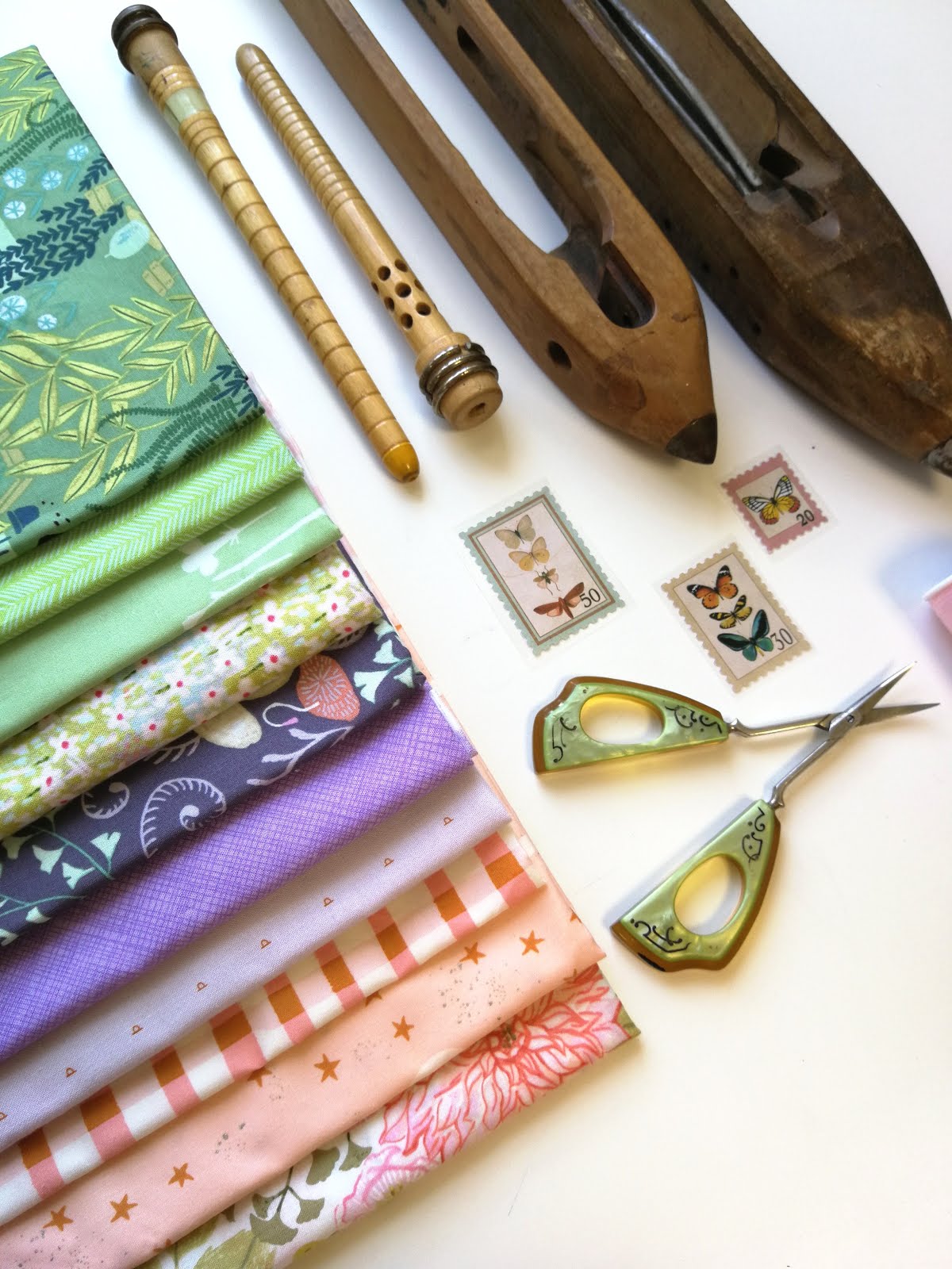
But what's a girl who has itching fingers, but no sewing machine supposed to do? Well, when her mini iron breaks, and applique blocks are no longer an option... then she buys fabric at half price, and cuts it up!

I generally don't cut for a whole project at one time, but this one happens to fit that case. Next July I will attend a class with Victoria Findlay Wolfe. It might sound a little over the top to be preparing for it so far in advance, but since cutting fabric was just about the only thing I could do during summer break, I just had to go with it... not to mention that I pretty much have my sewing/pattern writing/teaching calendar planned through next summer!?!


So, make sure you get a good look at this project because you won't see it again until next summer. I have to say that I'm glad that I was able to get everything cut for this quilt, so I don't have to stress about prepping in the middle of an already busy schedule... when the time roles around for the class, I can just sit down and sew. Hmmm...