Showing posts with label fabric stash. Show all posts

Sunday, August 18, 2019

Link-Up #summerstacksundays Summer Smoothie


When working on a fabric pull, just because there might be multiple colors in the inspiration fabric, doesn't mean that all the rest of the fabrics have to be packed full with just as many colors. She really IS the star of the show, and if there is too much competition for the center stage, the show doesn't run as planned. When the supporting fabrics are doing just that, even though there might be a lot going on in the inspiration fabric, she is somehow balanced.The supporting fabrics are supporting, and not trying to take over the show.


For the #summerstacksundays Link-up, I found that I ended up using several Anna Maria Horner prints that were my starting inspiration point. Her prints really lend themselves for being the star of the show. I have three designers that usually find a prominent spot in my quilts, and perhaps it's not hard to see why - her fabrics are the perfect combination of strong design and strong color. (a BIG win, win in my book)


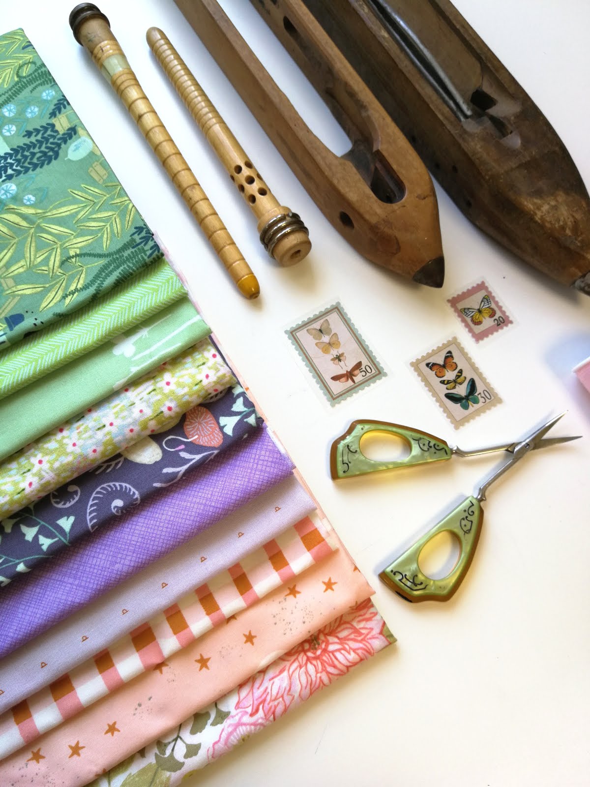
For this week's fabric stack, I really wanted to focus on some of the softer shades. On the photo, this stack might appear to still be fairly saturated, but live it's actually pretty toned down. Cover up that last darker periwinkle fabric, and you'll see what I mean. What I like about a multi-color print like this, is that there are so many color options to consider. I could focus on the bright vibrant pinks, or I could have gone with some deeper aquas, and even pulled in more of the periwinkle blues.


This week's challenge: Start out with an inspiration fabric and try a pull with soft shades... and then try it again with deeper and more saturated hues. I would love to hear about it... start stacking!

  
Remember that anyone can link up their fabric stack, even if you are coming late to the party. Be sure mention that you are linking up with Campbell Soup Diary for #summerstacksundays. You can also link up from Instagram. The link-up runs from July 5th - September 1st.

Please take the time to visit/comment/like the posts from others who are linking up and be sure to look through the comments. If you happen to be struggling with your fabric stack, then just say so in the comments, so the rest of us can stop by and maybe help you out... sometimes a fresh eye can see something that might have been missed.  

I decided to leave the last two weeks as an open theme... let's see what you come up with!


You are invited to the Inlinkz link party!
Click here to enter

Sunday, August 11, 2019

Link-Up #summerstacksundays Soft Summer


Can you believe that the first month of summer is over now, and we are well into the second half of it? Has it whizzed by, or have you had a chance to slow down, and stop and smell the roses? Either way, I hope you are having fun stacking.


When I think of summer colors, I actually think of two color ways. Obviously many of the summertime blooms are vibrant, bold, and colorful... but there is a softer side to summer, which is this weeks' theme: "Soft Summer". I started out with this print from Rae Ritchie as my inspiration. I absolutely adore her whimsy and playfulness of her fabrics.


This stack is not too far off from last week's complimentary color pull - "red" and green, but with accents of lilac. The inspiration fabric has several obvious hints on what to combine with it. I could have added more intense hues, but I enjoy working with a restrained pastel palette too.


Are you ready? Remember that anyone can link up their fabric stack, even if you are coming late to the party. Be sure mention that you are linking up with Campbell Soup Diary for #summerstacksundays. You can also link up from Instagram. The link-up runs from July 5th - September 1st.

Please take the time to visit/comment/like the posts from others who are linking up and be sure to look through the comments. If you happen to be struggling with your fabric stack, then just say so in the comments, so the rest of us can stop by and maybe help you out... sometimes a fresh eye can see something that might have been missed.  

If you are following the weekly themes, next week I'll be sharing a "Bright Summer" stack... which is completely left up to you to interpret how you want. See you then!

You are invited to the Inlinkz link party!

Click here to enter

Sunday, August 4, 2019

Link-Up #summerstackfridays Complimentary


Sometimes when I pull a stack of fabrics together, and take a second look to re-examine it, I realize that I've pulled a complimentary color scheme without actually intending to. If you have studied color theory at any length, then you know that the complimentary colors are: blue and orange, red and green, and purple and yellow.


Because complimentary colors are directly opposite from each other on the color wheel, they create the strongest contrast. When you work with pure color combos, the combination can be pretty intense. For me, a purple and yellow combo can leave you thinking of easter eggs and candy, and make you wish that you had brought your sunglasses along.


The best way to tame such loud explosions of color, is to play around with the colors' clarity, intensity, and value. When you are adding grey or black to a color, it tends to go a little muddy, which is exactly what has happened to some of these gold/ochre colors in this fabric pull. Once the color darkens, it starts to brown, which is why these colors would technically still be in the "yellow family".The red-violet colors are also a little muddy, which gives the overall fabric pull a less intense feel for a complimentary color combination. I can lighten the value of the color to add a little contrast.


This pretty floral print was my inspriation fabric for this week's fabric pull, and was really my starting point. Like some of the other fabric pulls that I've shared already, I played off of some of the existing colors in the inspiration fabric.


If I decide to eventually turn this stack into an actual project, I might consider adding a few of the reddish hues, but right now I am liking the restrait of essentailly a two-color palette.

  
So, let's get started - anyone can link up their fabric stack, even if you are coming late to the party. Be sure mention that you are linking up with Campbell Soup Diary for #summerstacksundays. You can also link up from Instagram. The link-up runs from July 5th - August 30th.

Please take the time to visit/comment/like the posts from others who are linking up and be sure to look through the comments. If you happen to be struggling with your fabric stack, then just say so in the comments, so the rest of us can stop by and maybe help you out... sometimes a fresh eye can see something that might have been missed.  

If you are following the weekly themes, next week I'll be sharing a "Soft Summer" stack... which will everyone might inturpret differently. See you then!

You are invited to the Inlinkz link party!
Click here to enter

Sunday, July 28, 2019

Link-Up #summerstackfridays Cool Colors

    
Are you living in a corner of the world where you are ready for the summer heat to cool down? There has been quite a heat wave in Germany this summer, and thoughts of ice cream, swimming pools, and cool breezes are occupying most people's minds these days.


Last week's summer stack, we warmed it up, but this week it's time to turn that color wheel to the other side and explore the cooler side of things with shades of green, blues, and purples. I like to challenge myself to try to take a color scheme and approach it differently than my usual high saturation / high contrast palette. When I think of cool colors, I think in the pure hues... essentially the colors at the top of the color wheel. Toning things down with softer, pastel colors that is still within the cool color range, is a fun alternative.


Again, this stack originally started out with an inspiration fabric from Anna Maria Horner... is it a little obvious by now that I am a big fan? This print is full of directional color cues that are quite easy to follow. I actually went with a fuller range, but this fabric could easily concentrate on just the blues or just the greens, without the additional fuchsia accents.


So, which color scheme do you find yourself leaning torwards... cool or warm? I suppose I have color moods, that can change from day to day. What are you stacking this week? Join in on the fun and link up with me!


Be sure mention that you are linking up with Campbell Soup Diary for the #summerstacks Link-Up party. Anyone can link up their fabric stack, even if you are coming late to the party, and I will keep the link open for a week. You can also link up from Instagram. The link-up runs from July 5th - August 30th.

Please take the time to visit/comment/like the posts from others who are linking up and be sure to look through the comments. If you happen to be struggling with your fabric stack, then just say so in the comments, so the rest of us can stop by and maybe help you out... sometimes a fresh eye can see something that might have been missed.  

If you are following the weekly themes, next week I'll be sharing a complimentary color scheme next week - red/green, blue/orange, or yellow/purple... which one do you think I'll pick?

You are invited to the Inlinkz link party!

Click here to enter

Sunday, July 21, 2019

Link-Up #summerstacksundays Warm Colors


So how has the weather been with you this summer... are you ready to warm things up a bit? We are now into week three of the #summerstacksundays link-up party, and what better way to celebrate summer than with a warm color palette.

 
Working with really bright and intense tones, is perhaps what makes my heart beat when it comes to working with color. In spite of this, I can sometimes have a very specific color palette in my mind when approaching a new project. I love the challenge of toning things down, pulling in the reigns, and grabbing for an outside of my color norm, go-to stack.


Just because you go for a warm or analogous color palette, doesn't mean that you have to go for colors in thier hightest intensity.The nice thing about an analogous color palette is that it is fairly easy because you are just picking the colors beside each other the color wheel. Here I have played with much lighter tints on the color wheel, by keeping the colors farily subtle.


Just a little something to think about: one common mistake that I see too often when pulling fabrics is that there is more attention paid to making sure that the colors are a perfect match, but less attention paid to that the style of the fabric should match as well. With this stack of fabrics, the motif's are a little more playful... I avoided damask, flowers, and overly ornate designs.


So, what are you stacking this week? If you are following the weekly themes, then how about if we cool things down next week, with a "cool colors" fabric stack - think greens, blues, and purples.

Be sure mention that you are linking up with Campbell Soup Diary for the #summerstacks Link-Up party. Anyone can link up their fabric stack, even if you are coming late to the party, and I will keep the link open for a week. You can also link up from Instagram. The link-up runs from July 5th - August 30th.

Please take the time to visit/comment/like the posts from others who are linking up and be sure to look through the comments. If you happen to be struggling with your fabric stack, then just say so in the comments, so the rest of us can stop by and maybe help you out... sometimes a fresh eye can see something that might have been missed.

You are invited to the Inlinkz link party!

Click here to enter

Friday, July 19, 2019

#summerstack Moves to Sunday!


Sometimes you find yourself mid-stream when you realize that you might need to change course a bit…and just hope that you’ve not gotten too far to turn back. I’ve come to the conclusion that Fridays may not be the easiest day for a link up party, which is why I decided to change the summer stack link-up party to Sundays. 


The goal is still the same: practicing, pushing yourself, documenting for future projects, and getting connected to other quilters. It’s still low key, but hopefully now on a slower day for everyone – summer vacation or not.  

If you are following the weekly themes, then how about if we warm things up next week, with a "warm colors" fabric stack - think reds, oranges, and yellows... we are headed into summer, you know? Look forward to seeing you there!

Friday, July 12, 2019

Link-Up #summerstackfridays Primary


One of the benefits of documenting fabric pulls is that it gives you a starting point, once you are actually ready to dive into a new project. If you are like me, you might have several projects going at one time, but may have to wait until the other projects are finished before starting new ones... having time to think about favorite fabric stacks may not always match the beginning of a new project.


So for this weeks' #summerstackfridays, I started out with this "Ladder" print from the Sweet Dreams collection, from Anna Maria Horner as my inspiration fabric.The darker dots are actually an interesting dark, greenish-khaki color that is a little hard to match up. Since I don't have very much of this color in my stash, I ended up letting it read a little more gold than green.


When you match up this color to a color card/wheel, you notice that this IS the same color... just a few steps above it. By staying in the same color family, I am able to work in a color that appears to not even be in the inspiration fabric... all I did was lighten it.


Since the gold fabrics that I chose also have some pink/coral accents, it connects to the inspiration fabric. Some of the lighter and darker shades of teal are fairly obvious picks, but if I am being perfectly honest, I have to admit that I struggle a little bit with this fabric pull... not the fabric selection part, but the end result. I'm not the biggest "primary color combo" fan. If you break this stack down, it is "blue, yellow, and red"... obviously not in it's pure and bright shades, but primary nonetheless. Visit my previous post for a few more ideas how to put a twist on your primary color palette.


Currently I have a project in the works, where I used a several of these fabrics. Since it is not a high priority, deadline project, it will be on the back burner for a bit. Now that I have it cataloged, I can pull this fabric stack back up when I'm ready to pick it up again and see where I left off. Keeping a fabric stash pull in the same photo folder is really helpful once a project is being pulled to the front burner again.


So, what are you stacking this week? Do you have any color combinations that you struggle with too? If you are following the weekly themes, then how about if we warm things up next week, with a "warm colors" fabric stack - think reds, oranges, and yellows... we are headed into summer, you know?

Be sure mention that you are linking up with Campbell Soup Diary for the #summerstacks Link-Up party. Anyone can link up their fabric stack, even if you are coming late to the party, and I will keep the link open for a week. You can also link up from Instagram. The link-up runs from July 5th - August 30th.

Please take the time to visit/comment/like the posts from others who are linking up and be sure to look through the comments. If you happen to be struggling with your fabric stack, then just say so in the comments, so the rest of us can stop by and maybe help you out... sometimes a fresh eye can see something that might have been missed.

You are invited to the Inlinkz link party!
Click here to enter

Thursday, July 11, 2019

Primary Colors - Adventure or Challenge?


If you talk about a primary color combination, the first thing that might come to mind is the inside of a kindergarten... pure hues of red, yellow, and blue have a tendency to be pretty intense, and especially daring as a fabric combination. For this week's #summerstackfridays link-up, for those following along with the weekly theme, a primary color palette just might be as challenging as one can get... but why no put a little twist on it?

Let's just start out with red... what happens when you add white? You end up with pink. And depending on how much white you add to it, depends on how light or dark a pink it is. Even a pink would still "technically" be in the red family. My red has a slight orange touch, and has been lightened, which means that am now working with tints of red. (a tint is a color + white) I've toned the intensity down, which will give less contrast when I combine it with the other colors.  Even though the bottom fabric has more of a pinkish-lilac background, the coral-red flowers connect to the other "red" fabrics that I've pulled.


For my yellows, again, I've not selected the purist hue of yellow, but have picked a warmer hue. This yellow is headed towards orange, but is still arguably in the yellow family. Because these yellows have added grey to them, they start to get a little muddy. When working with such muddy hues, they don't "bite" as much as when you are combining only pure hues.


Since there are limited names for colors, we often have a tendency to use a general color name, rather than specific color name. Obviously when you mix blue and yellow, then you end up with green. In this case, even though there is a lot of green in my blue, I don't feel like I can call it green just yet. For my primary color palette, I am really using secondary and tertiary colors. Those are just essentially the more specific colors in between the secondary colors. My red moves towards orange, and so does my yellow, and my blue moves towards green - a primary color palette with a twist!


So, when mixing your primary color fabrics for the link-up tomorrow, think about how you can put a little twist on your colors... do you want to lighten them? darken them? use muddy hues?  I hope that this second glance makes working with a primary color palette more of an adventure and less of a challenge. I''ll be sharing the full fabric stack tomorrow for the #summerstackfridays link-up... it's not too late to join in!

Friday, July 5, 2019

Link-Up Week 1 #summerstackfridays


Welcome to week one of the #summerstackfridays... I'm so glad you've joined in! As I mentioned in my introduction post, summer stack Fridays is all about carving out a little bit of time in the busy summer months to sneak in few creative, quilty mintues, even if it is just 10 - 15 mintues. Let's just face it - summer sewing doesn't have anything on the cold, winter months, but a link-up party gives you a chance to make it into your sewing room, even if you don't have the time to sew anything. ... and let's face it - what quilter doesn't love petting all her pretty fabrics, am I right?

Just in case you happened to miss my first fabric stack, be sure to backtrack where I shared a little of my process of how I select fabrics. For the link-up, you don't have to follow my method, but perhaps it helps you take a different approach when you select your fabrics. Remember, there is no wrong or right. Picking fabrics is purely personal, and what appeals to me, might not appeal to you. 


So, as a fun little experiment for this week's fabric pull, I wanted to start with the same "inspiration fabric" that I used last week. With my first stack, I used a lot of cool colors, but with this fabric stack, I wanted to warm it up - we are going into summer, you know! I added the middle brown fabric to connect some of the warmer colors into this stack. The second fuchsia fabric brings in a little element of orange, which connects to the warmer tones, while connecting to the inpiration fabric too.


And now it's your turn... just link up either from your blog or from Instagram, and be sure to use the #summerstackfridays hastag. Please visit some of the other fabric stack posts, because it's all about connecting. If you are struggling with your fabric selection, and would like for me (or others) to give you my (our) two cents - just say so in the comments! Happy stacking!


Just in case you would like to have a weekly theme, next week I will be sharing a "primary" fabric stack. Primary colors can be pretty insense, so if you struggle with working with such vibrant colors, it might be helpful to thinkin about playing with the values and clarity of the colors... make sure you look back at my "Art of the Fabric Pull" for working with values. For some fantasic primary color ispiration, be sure to stop by Rachel's blog.
You are invited to the Inlinkz link party!
Click here to enter

Friday, June 28, 2019

The Art of the Fabric Pull


Next week the #summerstackfridays Link-Up Party starts... are you ready? The Link-Up will start July 5th and go through August 30th, 2019. But before the fun begins, I thought that it might be helpful to give you a little behind the scenes sneak peek of my process of how I do a fabric pull... you know, it is my favorite part of quilting!


Several years ago I heard the best piece of advice on a home decorating show, and while it is so simple, it is so true... "start with an inspiration piece, and build around it". While I don't always start my fabric pulls with an inspiration fabric, it is definitely a great starting point if you are unsure of where to begin. The inspiration fabric for my stack is this pretty print, "Soma" in avocado, from Monika Forsberg's "Savernke Road" collection from Free Spirit Fabrics (Conservatory Fabrics).


So, you have your inspiration fabric... now what? Sometimes it's helpful to have an idea where to go from this point. Perhaps you've noticed the color/source code that is on the selvedge edge of your fabrics? This is essentially a resource for the manufacturer to reference the colors used in the printing process, but if you are uncertain of yourself when matching fabrics, it could really be a helpful tool.


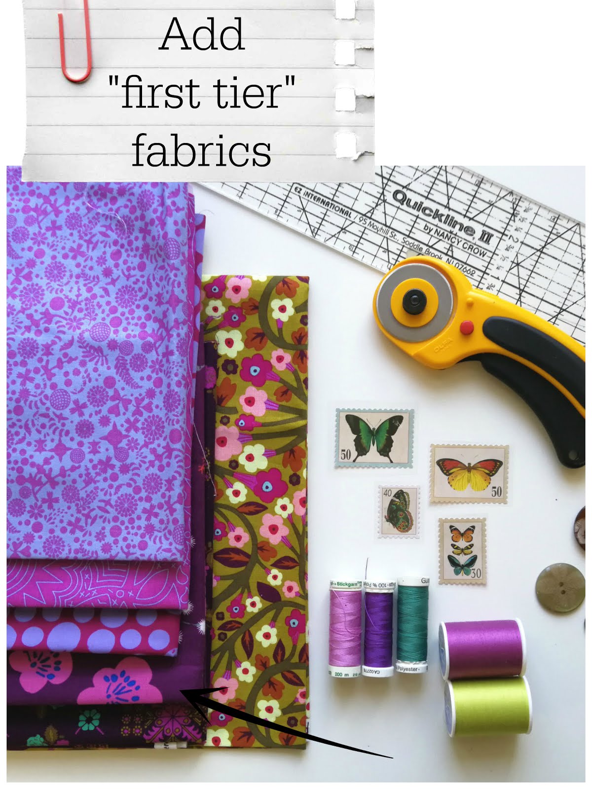
There are several colors that seem pretty "obvious"... so those should be the first fabrics you grab for. Below you will notice that my bottom two fabrics are a pretty good match up to the dark leaves from my inspiration fabric. I would consider these to be "first tier" fabrics. I've purposely chosen two fabrics that have multiple colors in them. The background color is spot on, but there are some additional colors that are being brought in that are not in the inspiration fabric.


When you take a look closer at my original stack, you probably notice that not all of the fabrics match to my inspiration print... so how did they make it in there?!?


This is the point where I start adding what I like to call "connecting fabrics". If you look back to the "first tier" fabrics picture, you'll notice that the bottom three fabrics brought additional colors into the mix that are not in the inspiration fabric. You especially see it with the middle spots fabric -the background matches the brighter pink in the inspiration fabric, but periwinkle is a new color. This means that I am now able to introduce this "new" color, because it "connects" to my first tier fabrics.


One of the biggest mistakes that I see people make when matching fabrics, is that they are not really aware of how colors are made. Do you know what happens to your color when you add white to it? grey? black? Do you know how your color changes when you add one of the primary colors to it? How red is your purple or how blue is it? Are you working with a yellow green or a blue green? Is your orange more yellow or more red? If you don't know these basics, once you start trying to lighten or darken a color, it makes it hard to recognize if you are still in the same "color family". Once you understand how colors are made, it makes matching those specific tints, shades, and tones much easier. With the fabrics below, what starts out as a yellow, ends up going a bit greenish when black is added to it, which means that I am still in the same color family


This is where you start adding what I would call "second tier" fabrics. These might not be as obvious as the first tier fabrics. The top three fabrics are essentially the same background color as my inspiration fabric... they've just been lightened or darkened. Again, I have purposefully added the third fabric because I want to "connect" other colors to it.


Next you can see that I am able to bring in additional colors that are not in the original inspiration fabric because I am connecting to colors in the tier fabrics. The bottom three fabrics connect to the the green leaf on the third fabric. The top green has pinks in it, which work with the other pinks that I've already added, and the middle green repeats the chartreuse yellow that was brought in with the last fabrics. The leaves on the last green fabric connect to the top two fabrics, which means I can bring in colors that may not "match" the inspiration fabric, but as a whole works well together. The last grey fabric that you see on top, has pinks, greens, and yellows, which are just a repeat of some of the other colors used.


So, now it's your turn to get started. Next Friday is the first link-up day, and remember, the link up is about practicing, pushing yourself, documenting, visiting others and helping them out. I've had requests for a theme, so I thought that next week's stack should be "Inspiration Fabric". You don't have to follow the weekly themes, but for some it's helpful to have a little direction... I
I can't wait to see what you stack up!

Wednesday, January 16, 2019

Nadelwelt Class + Free Fabric Swatch Cards


Last week I shared about several upcoming events, one of them being my class offered at Nadelwelt on Color Theory for Quilters. I am super excited about this class becuase I am super excited about color! I think my love of color came from my dad, who finished college with an art degree.


 I suppose that I've gushed a time or two about my super talented dad, and I remember all those "teachable moments" that he took full advantage of when I was young. He would  always sneak in a narration here about contrasting colors, or a comment there to point out a particular color scheme... my life was filled with mini art lessons, painting sessions in our furnace room, and tips on mixing paint colors. While I feel that working with color is very intuitive for me, I realize that perhaps all those times heavily influenced me in the way I approach color now.


 Since I realize that not everyone has had the advantage of daily art lessons since childhood, my hope is that teaching about what I've learned about color can take some of the guesswork out of picking fabrics for projects... it is my favorite part, you know?


So, you may have noticed in my last post, little cards with fabric swatches on them. I decided that this would be the prefect way to play around with fabric combinations without class participants having to travel with their whole stash!?!


I've started making cards myself, and I think it can really give you a better understanding of your tastes, likes, and dislikes. Painfully missing from my stash has been, and always will be, red. Kind of hard to believe that a beautiful red chair takes center stage in our living room, huh? But, I think seeing your stash in this way helps to assess what you have and what's missing, and what you "need".


Fabric swatch cards are a great way to do a pre-pull before that big explosion that we all know happens... please don't tell me that I am the only one whose room literally looks like a bomb has exploded after the fabric pull has commenced?


How many times, have you been fabric shopping, and you've had to manage those loose swatches to find a missing accent fabric OR you ended buying a fabric that you were just certain was a perfect match, only to realize once you got home that you were a couple shades off? These are great to slip in your wallet when you head to your local quilt shop.


So, even if your aren't able to make it to Nadelwelt, I thought I would share these little fabric swatch cards that I made... for FREE! They're in English AND in German. Go on... show me your stash!
Related Posts with Thumbnails