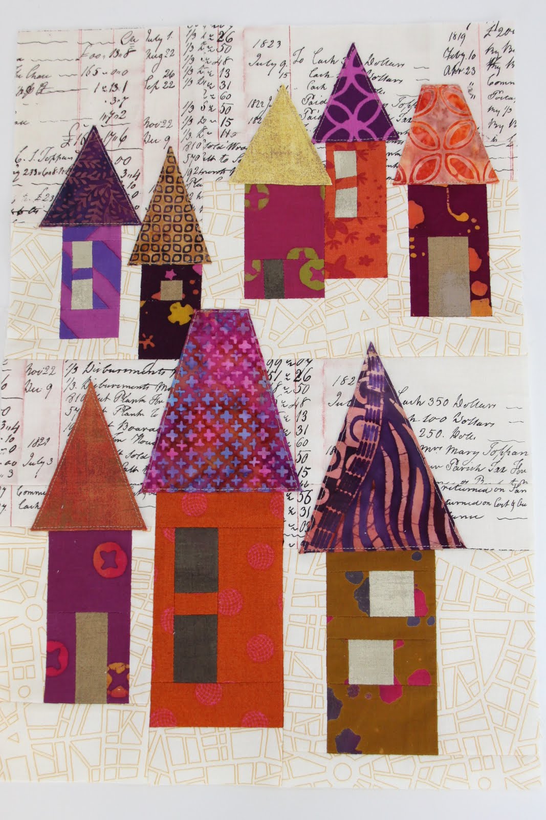
If you follow me on Instagram, then you know that my week has been more about snip, snipping than it has been about stitch, stitching... which is highly unusual for me. When I work on a quilt, I usually cut a few blocks at a time, and then throw them under the machine, because if I'm being perfectly honest, then I might be a little impatient in that way.
I suppose there are two main reasons for this: firstly, I need a constant change of pace - I don't think I've cut a whole quilt before I started sewing it... ever! Perhaps it's because I just can't wait to get to the best part - sewing! I know, I know, it can really be a time saver to cut everything ahead, but it feels like pure torture to me to not just sit down and get started when the inspiration hits.
Secondly, I like to make things up as I go... it's just that sometimes I just
don't know where I'm going with a quilt until I start. Once the first
blocks are done, then they give me hints on how I should address the
next ones. It somehow give me a freedom to go a different direction than previously planned if needed.
I get teased sometimes that I usually don't know how big a quilt top will be until I've actually finished it. (which is why I often end up with much bigger quilts than I'd planned) But there is something to be said about letting the quilt tell you how big it wants to be rather then me putting too many limits on it.
So now that it's not even two weeks until our fall retreat, I've decided to pull my Penny Sampler back out to have something to work on... I have to say that these are pretty labor intensive, one-thousand-bits-in-one-block blocks. But just to mix things up a bit for a change, it will actually be nice to just sit down and sew.
Do cut everything before you start sewing or do you let your quilts tell you how big they want to be?
I'm still stackin' on the 30 Days of Fabric Stacks challenge from Stitched in Color, and I've been enjoying exploring various themes and colors that I might not have come to on my own. Missed my other stacks?... see what I've come up with so far here and here.
For the theme Scale I ended up thinking about a good bit before I pulled it together. I love big scale fabric, but they don't always translate into a good quilt when there are too many around, so that's why I wanted to use both large scale and small scale prints in this fabric pull.
You may recognize these fabric pull from an already existing project, but as I was making the pillow for my husband, I realized that I liked the pull so much that it might be fun to re-visit up close and personal. It's a little harder pull for me since I have so many florals and girly prints in my stash, but I think these fit the bill for the Masculine theme just fine.
I actually use a good bit of Aqua in my quilts, but they usually don't take center stage as in this stack. These soft shades are the perfect pair up with what else than... green!
I was really excited about the Novelty pull because it explores several of those just fun fabrics all at once. I like to add a subtle touch of whimsy here and there, but it's so much more fun when they all get together.
As much as I love pink, this one took me a while. First I started off with some light pinks, but shades in pink are just a various as shades of green. But true to my usual style, I love a yummy orange combo with pink... it kind of reminds me of strawberries and oranges - so refreshing!
The name my husband actually guessed this color palette was "happy clappy"... and I suppose that he is not too far off on this. While Clashy Bright is perhaps not a color palette that I might personally use, I appreciate the push outside the box.
Are you stacking along too? Any fabric challenges that have uncomfortably stretched you or you found to be a really big challenge?
This the second round of the #30daysoffabricstacks challenge, and can I just say that I am truly in my element? If only actually quilting quilts would be this much fun too... hmmm.
#yellow is a pretty important color in my color stash, and I love to grab a little touch of sunshine for my projects. With that being said this good mood color can sometimes be tricky to mix and match because there are so many different shades... lime, gold, primary.
#handprinted. you may remember some time ago that I had shared those fabulous lampshades that I'd been drooling over for a long time... well, when I ordered them I threw a scrap pack into my cart with them. These treasured bits match my living room so well, but until I nail down the project, I'll have to be happy to pull them out every once in a while and stroke them.
#softlyagainstblack is a dig REALLY deep into the bottom of my stash fabric pull. I've only recently started adding the occasional grey to my projects, and black is pretty much a no-go for me. These almost blacks have made it into my stash through bundles, but I can only imagine them as very small accents to a project.
#fabriciwant the #30daysoffabricstacks challenge is being hosted by @stitchedincolor, and is being sponsored by @bobbieloufabric, and of course who doesn't love shopping for fabrics, right? any other "she who has the biggest fabric stash when she dies" folks out there? It actually looks like I might have purposefully matched my fabric wishes here, but I honestly threw in my folder what appealed to me, and this is what came out of it... ok, a little selection involved, but seriously, this was mostly by chance.
#complimentarycolors even though I have studied the color wheel enough to know what fits where, I've never been the biggest fan of complimentary colors schemes... they always looked more like football uniforms to me. But when you look at some of the secondary color combos, that's where my interest start to peak.

#green well, I suppose in light of things, perhaps it's only fitting to save the best for last, and that is my favorite color... green. I think I could pull about 30 different stack of just green if I wanted to! Seriously, this is the biggest and most dominant corner of my stash. There really aren't too many shades of natures color that I don't like. You might notice several Alison Glass fabrics that have showed up in stack after stack of mine, simply because Iove how such a subtle blender pulls out the other colors in the fabrics to add interest. FYI this AG sun print on the top will go down as my all time favorite green fabric. So sad that I don't have bolts and bolts of this for all eternity.
#30daysoffabricstacks runs until August 6th, so there's still plenty of time to join in on the fun!
Stitched in Color, is hosting a really fun challenge on Instagram, sharing fabric stacks from your stash based on certain themes for 30 days. (details on her blog) The whole idea behind it is to push and stretch yourself beyond your go-to color palettes. Perhaps you already know this about me, but pulling fabrics for a project is my favorite part of making a quilt (if only I felt that ways about actually quilting quilts, then I'd have it made). There are several color palettes that have been a challenge for me, and several that I would have never explored otherwise...
Day 1 #trueblue. This one is a bit of a challenge since blue is my second to last fabric that I grab for my projects... not to say that I don't use it at all, but it's not a natural for me when there are colors like green around.
Day 2 #ethereal. Despite the fact that I usually tend towards high popping contrasts when it comes to a color palette, there is a real appeal to me to have alluring and subtle contrasts. These soft corals, lilacs, pale aquas, and chartreuse accents give a quiet, yet impactful punch.
Day3 #orange. There was once a time that I literally had at least a touch of orange in every room in my house. I grew up with orange, and if I had it my way, there would still be orange carpet in my parents living room today. (uh oh, I'm dating myself as a 70's child) In any case, I recall that an orange and fuchsia color palette appealed to me even at a young age.
Day 4 #newfabric. As
silly as it may sound, most of my fabric shopping consists of stash
building rather than buying fabrics for specific projects. I have my go-to
colors, and I am confident in my preferences. Even though I am simply adding fabrics to my stash, sometimes it ends up looking like a planned project instead.
Day 5 #baby. I know that it's
possible to create gender neutral quilts for babies, but I much prefer
more gender specific projects instead. Since I ended up with three
boys in the house, (the one I married and the other two that look like
me) I never really had a chance to play around with fabrics that I might
have chosen had one of them been a girl.
Day 6 #folksyfall. I was actually really excited to "re-visit" this color palette... doesn't it remind you of this project? I'm quite drawn to bold and stark contrasts on a deep chocolate background. It gives another kind of pop than if it were on a light background.
In case you are wondering, there's still time to join the contest... it runs until August 6th, and in any case, it's good practice and fun to re-discover old favorites that might be hidden in your stash.
Any American girl, who grew up watching Jane Austin type classics, can identify with the feeling of awe when watching the exchange of niceties between two well-breed, fine ladies at tea time. The romantic mental image that comes to mind is that of the host asking her perfectly perched guest if she would like a spot of tea? As any proper lady, who is the epitome of utmost decorum would do, follows the previous question with... "would you like one lump or two"?
I remember the very first time that I came to visit Germany. My future mother-in-law had produced the most delightful spread of afternoon treats for the occasion. While it was not the traditional ritual of perfect-picture refinement and etiquette, I felt the inner girl in me beam with delight, when I noticed, sitting there before me was a bowl full of lumps... sugar cubes to be exact, which is something that is not so commonly found on the other side of the pond.
Perhaps it goes without saying that these two paper pieced tea cups remind me of that deeply engraved memory, and why their addition in my Penny Quilt, is just another way that this quilt is continues to tell my own personal story.
If you are familiar with American culture, then you know that tea is not such a deep seeded tradition. Our culture seems to be more about take-it-on-the-go Starbucks coffee, rather than high tea in the afternoon. Perhaps it could stem from, as I learned in one of my history classes long ago, that ever since the British Tea Party, that Americans gradually moved away from tea, and moved towards it's alternative caffeine source of coffee. Since living in Germany, tea has actually become very much a part of my everyday.
Speaking of tea... I had mentioned last week that I was considering tea staining some of my fabrics... don't you think it's quite fitting to talk about it now? Since several of my favorite, go-to low volumes tend towards white, they just don't work for the vintage look that I am going for in this quilt top. So, here's what I've found from my experiments:
You can see the original fabric on the left. I first started with leaving the fabrics in the tea for an hour. Once I pulled them out, they were simply too dark and too reddish for what I wanted. I then changed the type of tea, and tried for only 10 minutes, since I didn't want the fabrics as dark as the first batch. The color was more brownish, which is what I was going for, but still too dark even after 10 minutes. So, I threw the same fabrics back in only for 1 minute, and got the color that I was looking for. I used a Darjeeling tea on the 1 hour batch, which is a very light colored black tea, even in the cup. Even though Ceylon or Assam teas are darker, they gave the the right shade that I was looking for in the 1 minute/10 minute batch. I did notice on the Carolyn Friedlander Ledger fabric (bottom row) that the tea stained the fabric in a mottled look, which can be quite fitting for this use, but may not be desirable for other projects.
What category do you fall into... an on-the-go coffee drinker or do you prefer slowing down for an afternoon tea? Any hot beverage stories?
Linking up this week to Let's Bee Social and Stitched In Color.
The
purple heart is a medal of honor that is awarded to those who
have been wounded or killed in service. For me, it is a symbol of
bravery and courage at a level that is often so beyond oneself. When
I started making the "Heart Quartet" block for my Penny Sampler quilt,
somehow I kept coming back to that one heart just "needed" to be
purple. My original direction was about the color, but then it became about this block telling my own personal story.
Only those who have picked up and left what was once called home, the people that they love and care for, and even the way of life, to live somewhere else, can truly comprehend the depth of what it means to do so. Many have told me that I am brave to have made such a step. From the inside, it doesn't always feel like that. It's true that my daily struggles and emotions of living and operating in a foreign country have often felt like a daily battle.
Before I knew it, I was making a block that represents me with my "boys". I am the one who is different from the rest, the purple heart, shining with courage... the courage that it took to follow my heart and leave everything behind. The map background fabric represents the long journey that I took to be with the man who completes me in every way.
There are several other blocks that I feel are very personal to me too, and tell more of my story. Perhaps it's quite fitting for such a quilt to find it's home in the room that I share with my family, and one of the most used rooms in the house.
Do you have any personal stories of bravery and courage?
Linking up this week to Let's Bee Social.
Did you ever have a quilt that sat on your to-do list for a really long time?... I'm talking about more than just the flavor-of-the-month long time, but over a year or two long time? If you were to look at the quilts on my bucket list, I would have to say that I am a total sucker for a sampler quilt. While I love modern, bright, and bold fabrics in super saturated colors, there is a certain appeal to me to give those traditional quilts that inspired today's quilting movement a big nod.

It turns out that the Penny Sampler quilt from Rachel at Stitched in Color has been that on-my-brain quilt for quite a while now. I had actually almost purchased it last year, but because I had other things on my plate, I filed it away in the back of my mind. Well, it just wouldn't go away, and when Rachel posted that she would be doing another class... seriously, what was a girl to do? The pattern is set up as a six month, twelve month, or an on your own plan. I started out with the on your own version, but might switch to the six month group so I can join in on the fun.
This quilt will make it in my living room, and adorn a spot beside my highly honored and daily used quilt that my aunt made me. As I have been working on this quilt, there are several blocks that I feel like relate to my own personal story. Somehow this block makes me think of a neighboring German village:
My vision for this quilt is to actually stay with toned down and less saturated colors... I would really like this quilt to have the look of an heirloom that has been in the family for years. You really have no idea how hard it is to stay away from those strong popping color contrasts. I have used several Alison Glass batiks that I've been saving for just the right project. Instead of bright yellow, a muted gold takes its place. I have even thought about tea staining a few of the background fabrics to give it a worn look, but we'll just have to see if that actually happens.
My Penny Sampler is just one of my yearly goals projects, and I think a nice finish at your own pace project for the year.
Linking up to Let's Bee Social.