My Jeweled Kaleidoscope pattern, to be released this week, October 12th, comes also with the option to be made without the center circle appliques. I shared my pillow that I had made with a simple graduated color palette, but I wanted to share a few layout variations that could also be used for larger quilts.... and the amazing thing is that the change in design all comes from simple color placements.
For this first layout, I'm still stuck on these soothing cool colors using Basic Grey grunges mixed with some of my favorite printed fabrics.
... for this next layout, I wanted to have a little more negative space to show off the pinwheels. For the free motion quilter, so much negative space can be a dream.
Here is another graduated layout, but without the center circle appliques it takes on a completely different look. The accent is now on the strong navy contrasting petals.
Even though I don't really work with solids, I appreciate the heavy punch that they pack. And this layout in shades of purples, greys, and navys is no exception
For this quilt, there is a secondary graduation colorway. Firstly the graduation of the purple tones, and secondly with the movement fromgrey to blue tones. The navy accent petals bring even more contrast.
So, there's only one question let, have you decided how you want to make your Jeweled Kaleidoscope quilt?
Linking up to Let's Bee Social.
I really love what my pattern testers have come up with so far for my Jeweled Kaleidoscope pattern, and several have not only explored various color palettes, but also design variations. My first pattern tester, Mareike, really pushed the limits in exploring the kaleidoscope possibilies of this pattern. Read her blog post about finding the kaleidoscope structures in a soft color palette. I wanted to explore additional options with the same layout... and of course with lots of color!
Somehow I have really been drawn to the cool color palette, but also wanted to think about how this might translate into a warm color palette.
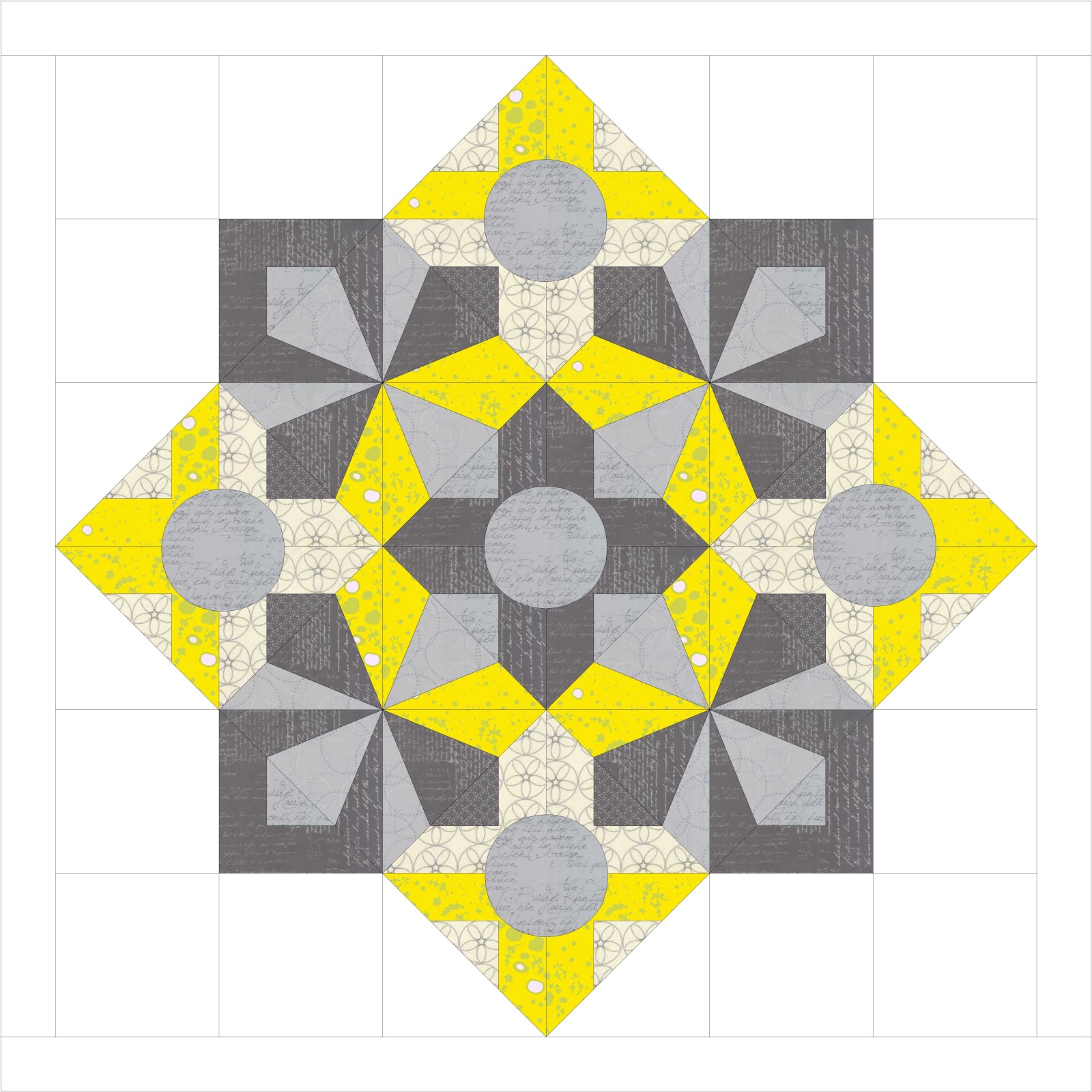
I've seen so many projects using a simple grey and citron colorway, and this combination shows what a nice compliement the two colors are to each other.
Even though I really had to work hard to build my purple stash, it really is a favorite color of mine. I couldn't resist using these Alison Glass fabrics combined with stash must-haves Zen Chic greys.
Another one of my pattern testers had the idea to put the blocks on point. Elina has a good feel for both color and design, and I love the well thought out little detailed accents that she included in her pillow. Here again, exploring with cool colors using my favorite Basic Grey grunges.
... and the same concept of the design on point, but with a few fabric placement changes. I love this strong, yet soothing blue background.
So, does this bring back memories as a child, looking through a kaleidoscope and being fascinatied about the endless designs that danced before your eyes? Well, it doesn't end here either... more to come next week as well as the official release on October 12th!
Next Wednesday, October 12th, is the official launch of my Jeweled Kaleidoscope pattern and I couldn't be more excited! Over the next weeks I wanted to share with you various projects and color options for using this pattern. Last week I shared the mini version without the center appliques, and it's amazing how a pattern changes with mere color changes. It has been helpful for me to shuffle colors around, and for comparison, first here is original version in cool colors paired with a soothing grey.
Next I changed the outer fabrics to a dark grey, and used the same soft grey for the center circles. I love how this looks with the center circles taking the backstage, and the background becoming more dominant.
I've had my eye on the Handcrafted Patchwork batiks from Alison Glass for a while now, but since you can't buy every fabric that you drool over, it's nice to still play with them in EQ7. Here I changed the center fabrics to the light grey and stayed with a graduated color palette like I did for the optional version. hmmm... perhaps a future fabric splurge IS actually needed.
Again, the same fabrics, but with a darker contrast for the background.
I've only gotten started with color inspiration, so be sure to stop back by this and next week for more color options and layouts. Wanna see what my pattern testers are creating on Instagram? See them under the hashtag #jeweledkaleidoscopequilt.
Linking up to Let's Bee Social.